One of the cool things I do as a designer is bring people's vision to reality. This offers me a cool advantage as I'm working through my books.
Take the logo as an example... I knew I wanted the title treatment to stand out and be interesting. I also knew it had to have a Magical 'feel' to it and so I created the Glyph by laying each line on top of each other and then running effects on it inside of Photoshop. The logo came out as I had envisioned and I am very pleased with it.
Ethan's design wasn't exactly what I wanted, but as I worked through it realized it worked. Part of what he goes through changes him profoundly and as a result his appearance is younger than his age would normally dictate.
Valk's was more specific and she was pretty solid in my head. So when I rendered her and then had to put all the tattoos on her it was pretty damn close to what I envision her as. Maybe not so large in the chest area but everything else is what I had in mind.
Melissa was a photo I found and was like it capture her 'essence' but not really what I imagine her face as...
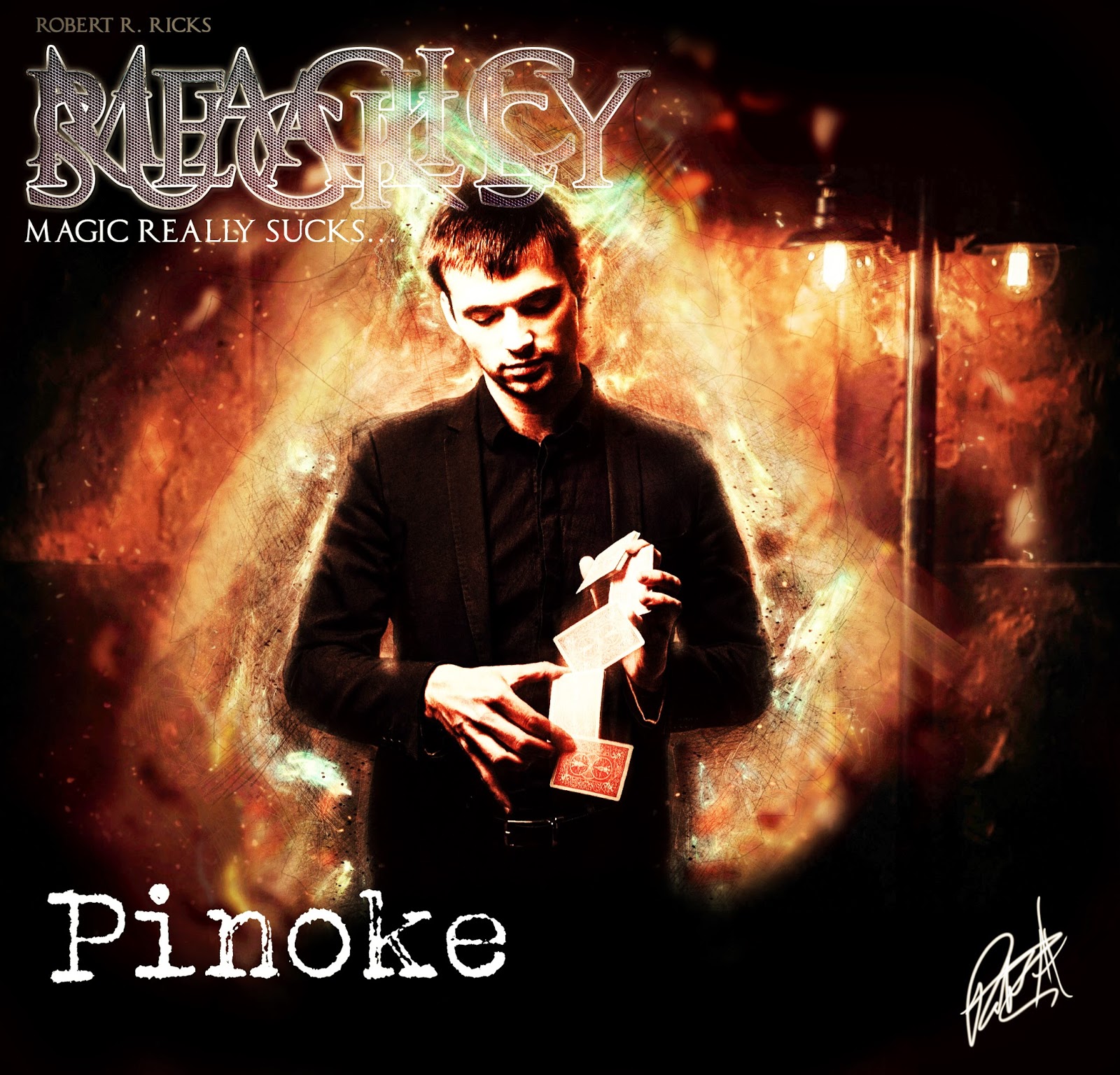
This is 'close' but not quite right. He's a bit too skinny in this design but the feel is good and I thought it was a good first stab at him.
A little too much make up but the hair and face structure is what I envision for her. The eyes need to be wilder. But again, for teaser stuff this captures some of what makes Fiona Fiona...
Kat was one of those characters where it didn't really mater too much until we got to the second book and then I was like hmmm. What does she look like. I had fun with the renders on her. Trying to find an intense yet wounded, innocent look...
Randy had many forms and faces... but this is the Legion form... The host for it anyways. I think out of all of them this pic really came close to what he looks like in Magic Really Sucks later on.
This more captures the 'essence' but not the real look of Mordecai. He's taller. More gaunt. Covered in crazy tattoos... But the electrical aspect of this pic is what I was after.
My daughter drew this for me as I explained Sparkles and I loved it. Thought it was pretty awesome so I'm sharing. The problem with Sparkles is that damn iridescent fur of hers. Really pretty to see when the light hits her and she's moving. Hard as HELL to try to get as an image...


No comments
Post a Comment